

5일차에는 라이트/다크 모드 설정을 진행해보겠습니다.
오늘도 갓대리님 영상을 참고하여 개발했습니다.
Next.js 나만의 포트폴리오 사이트 만들기 (개발하는 김에 배포까지) / LottieFiles, Notion Api, TailwindCSS

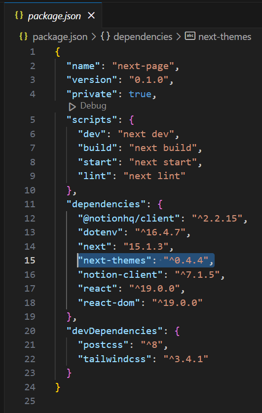
🔖 next-themes 라이브러리 설치하기
터미널에서 아래 명령어로 next-themes 라이브러리를 설치해줍니다!
$ npm install next-themes
or
$ yarn add next-themes
설치가 잘 되었는지는 package.json에서 확인할 수 있습니다.
🛠️ 코드 수정하기
다크 모드를 지원하기 위해서는 layout.js에서 두 줄의 코드를 추가해야합니다.
import { ThemeProvider } from 'next-themes' // 추가

export default function Layout({ children }) {
  return (
    <html suppressHydrationWarning>
      <head />
      <body>
        <ThemeProvider>{children}</ThemeProvider> // 추가
      </body>
    </html>
  )
}
만약 아래와 같은 Hydration failed 에러가 발생한다면?
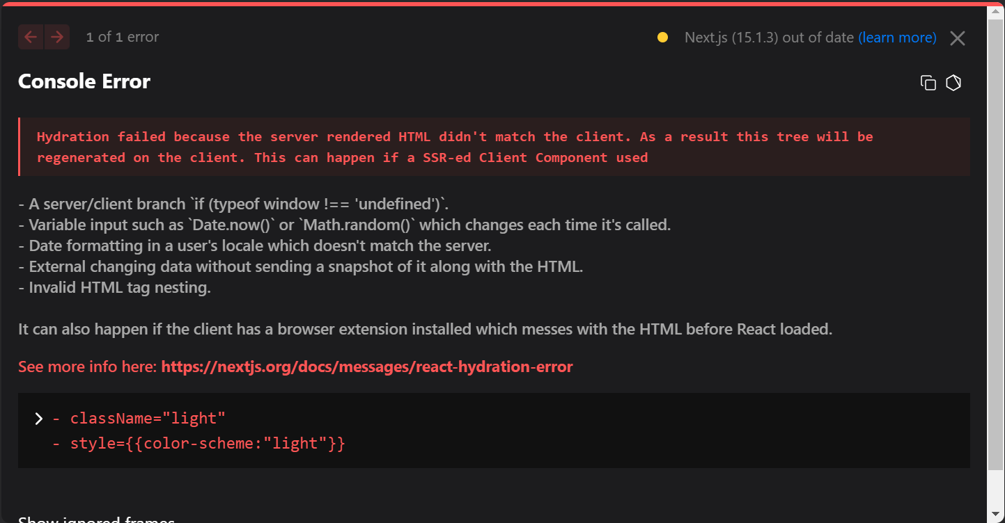
<html>에 suppressHydrationWarning를 추가하면 에러가 사라집니다!
ThemeProvider가 클라이언트 컴포넌트이기 때문에 suppressHydrationWarning를 추가하지 않으면 next-themes가 요소들을 업데이트해서 에러가 발생한다고 합니다.
모드를 변환 할 토글 버튼 js를 만들어줍니다.
버튼 코드는 기존의 header에서 가져옵니다.
export default function ThemeButton(){
    return (
        <>
            <button className="inline-flex items-center bg-gray-100 border-0 py-1 px-3 focus:outline-none hover:bg-gray-200 rounded text-base mt-4 md:mt-0">Button
              <svg fill="none" stroke="currentColor" strokeLinecap="round" strokeLinejoin="round" strokeWidth="2" className="w-4 h-4 ml-1" viewBox="0 0 24 24">
                <path d="M5 12h14M12 5l7 7-7 7"></path>
              </svg>
            </button>
        </>
    );
}
next-themes에서 useTheme를 import 합니다.
theme는 현재 테마의 값을 가져오는 getter고 setTheme는 현재 테마를 설정하는 setter입니다.
버튼을 누르면 현재 테마가 light면 dark로, dark면 light로 변하는 토글 기능이 구현됐습니다!
import { useTheme } from "next-themes";

export default function ThemeButton(){
    const { theme, setTheme } = useTheme()

    return (
        <>
            <button className="inline-flex items-center bg-gray-100 border-0 py-1 px-3 focus:outline-none hover:bg-gray-200 rounded text-base mt-4 md:mt-0"
                type="button"
                onClick={() => setTheme(theme === 'light' ? 'dark' : 'light')}
            >Button
              <svg fill="none" stroke="currentColor" strokeLinecap="round" strokeLinejoin="round" strokeWidth="2" className="w-4 h-4 ml-1" viewBox="0 0 24 24">
                <path d="M5 12h14M12 5l7 7-7 7"></path>
              </svg>
            </button>
        </>
    );
}
만약 아래와 같은 attempted to call useTheme() from the server 에러가 뜬다면...

맨 위에 'use client' 코드를 추가하면 됩니다.
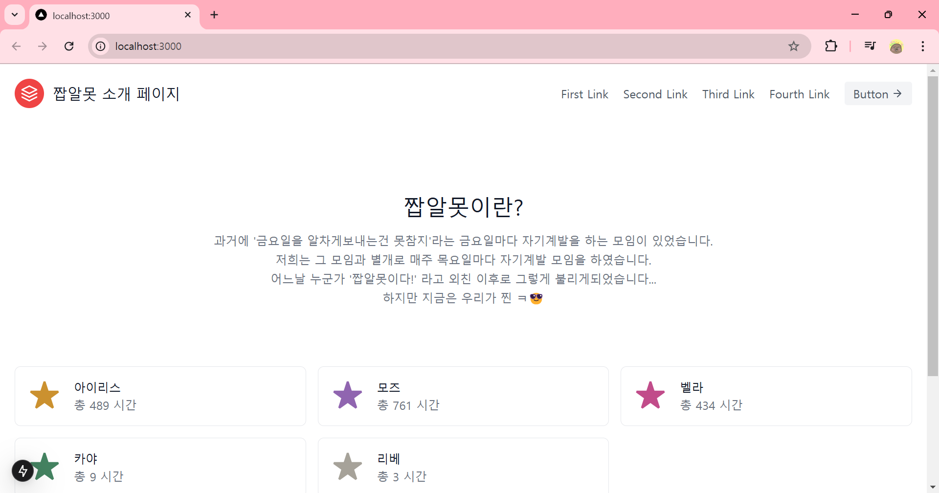
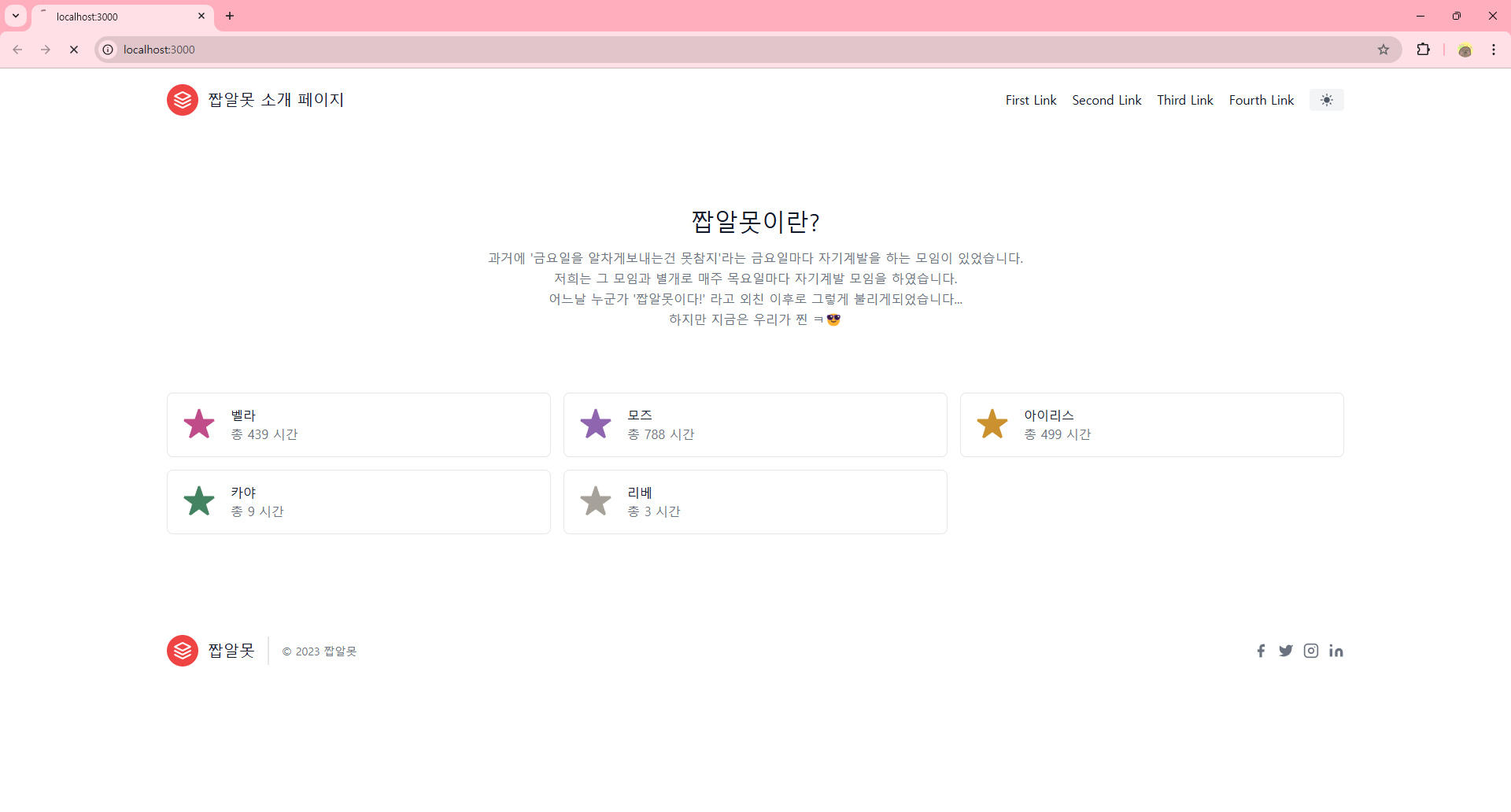
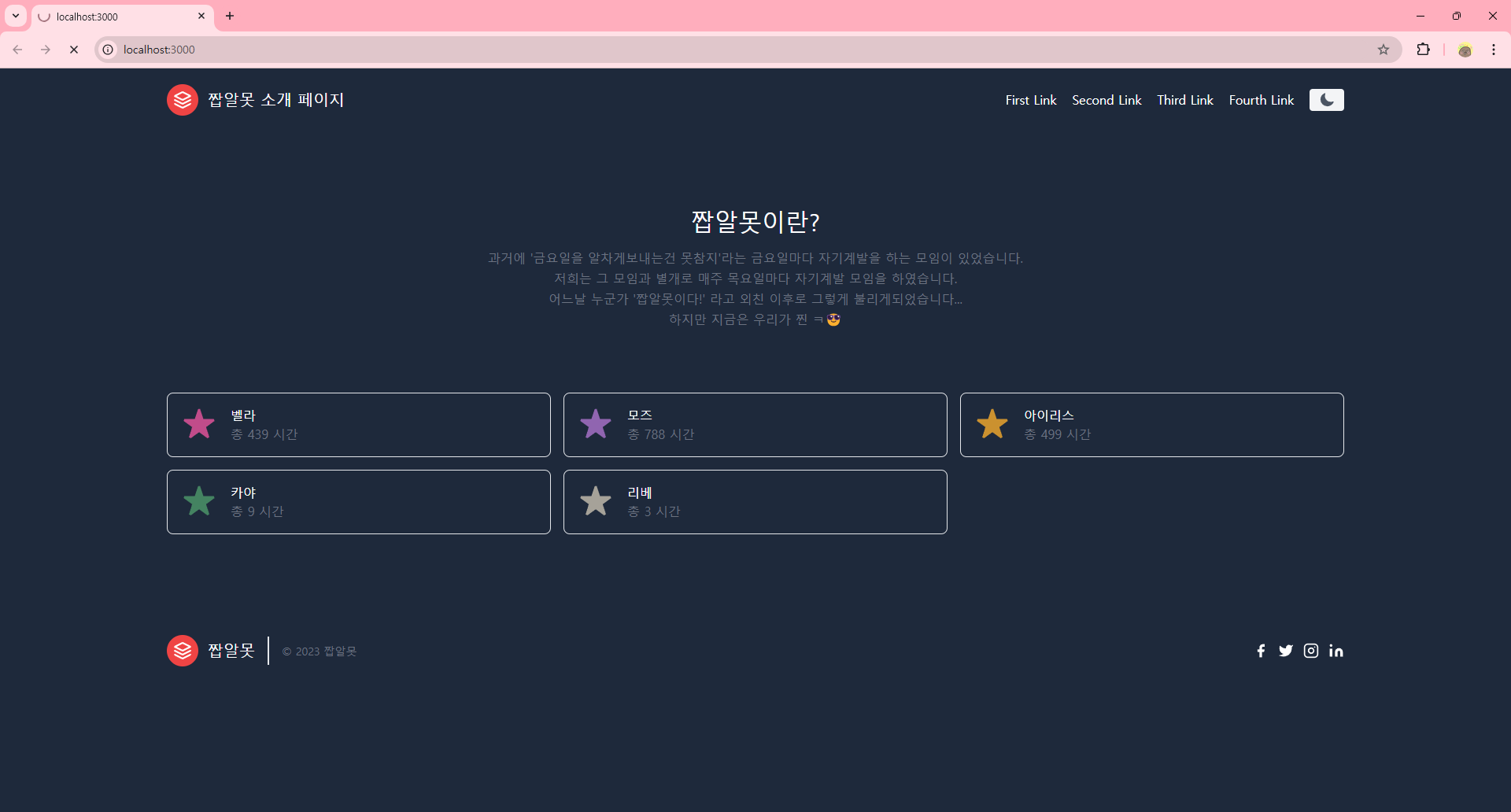
성공적으로 렌더링이 되었다면 버튼을 눌러 배경색이 변하는 것을 확인합시다!!😎

🖼️ 버튼에 이미지 추가하기
아래 사이트에서 버튼에 추가하고 싶은 이미지를 찾은 후 Copy JSX를 합니다.
Heroicons
Beautiful hand-crafted SVG icons, by the makers of Tailwind CSS.
heroicons.com
기존 코드의 <svg>를 지우고 붙혀넣고 class는 className으로 변경해줍니다.
라이트 모드일 때 사용할 해 아이콘과 다크 모드일 때 사용할 달 아이콘을 추가합니다.
'use client'

import { useTheme } from "next-themes";

export default function ThemeButton(){
    const { theme, setTheme } = useTheme()

    return (
        <>
            <button className="inline-flex items-center bg-gray-100 border-0 py-1 px-3 focus:outline-none hover:bg-gray-200 rounded text-base mt-4 md:mt-0"
                type="button"
                onClick={() => setTheme(theme === 'light' ? 'dark' : 'light')}
            >

            <svg xmlns="http://www.w3.org/2000/svg" viewBox="0 0 24 24" fill="currentColor" className="size-6">
                <path d="M12 2.25a.75.75 0 0 1 .75.75v2.25a.75.75 0 0 1-1.5 0V3a.75.75 0 0 1 .75-.75ZM7.5 12a4.5 4.5 0 1 1 9 0 4.5 4.5 0 0 1-9 0ZM18.894 6.166a.75.75 0 0 0-1.06-1.06l-1.591 1.59a.75.75 0 1 0 1.06 1.061l1.591-1.59ZM21.75 12a.75.75 0 0 1-.75.75h-2.25a.75.75 0 0 1 0-1.5H21a.75.75 0 0 1 .75.75ZM17.834 18.894a.75.75 0 0 0 1.06-1.06l-1.59-1.591a.75.75 0 1 0-1.061 1.06l1.59 1.591ZM12 18a.75.75 0 0 1 .75.75V21a.75.75 0 0 1-1.5 0v-2.25A.75.75 0 0 1 12 18ZM7.758 17.303a.75.75 0 0 0-1.061-1.06l-1.591 1.59a.75.75 0 0 0 1.06 1.061l1.591-1.59ZM6 12a.75.75 0 0 1-.75.75H3a.75.75 0 0 1 0-1.5h2.25A.75.75 0 0 1 6 12ZM6.697 7.757a.75.75 0 0 0 1.06-1.06l-1.59-1.591a.75.75 0 0 0-1.061 1.06l1.59 1.591Z" />
            </svg>

            <svg xmlns="http://www.w3.org/2000/svg" viewBox="0 0 24 24" fill="currentColor" className="size-6">
                <path fillRule="evenodd" d="M9.528 1.718a.75.75 0 0 1 .162.819A8.97 8.97 0 0 0 9 6a9 9 0 0 0 9 9 8.97 8.97 0 0 0 3.463-.69.75.75 0 0 1 .981.98 10.503 10.503 0 0 1-9.694 6.46c-5.799 0-10.5-4.7-10.5-10.5 0-4.368 2.667-8.112 6.46-9.694a.75.75 0 0 1 .818.162Z" clipRule="evenodd" />
            </svg>

            </button>
        </>
    );
}
두 개의 아이콘 이미지가 버튼 안에 들어간 것을 확인할 수 있습니다!
라이트 모드일 때는 해 아이콘만 다크 모드일 때는 달 아이콘만 나오도록 코드를 수정합니다.
- ☀️ : className="visible dark:invisible dark:h-0 dark:w-0 h-5 w-5"
- 라이트 모드 일 때 요소가 보임 visible , 다크 모드 일 때 요소가 안 보임 invisible
- 라이트 모드 일 때 높이와 너비를 5로 설정, 다크 모드 일 때 높이와 너비를 0으로 설정
- 🌙 : className="invisible dark:visible dark:h-5 dark:w-5 h-0 w-0"
- 라이트 모드 일 때 요소가 안 보임 invisible , 다크 모드 일 때 요소가 보임 visible
- 라이트 모드 일 때 높이와 너비를 0으로 설정, 다크 모드 일 때 높이와 너비를 5로 설정
'use client'

import { useTheme } from "next-themes";

export default function ThemeButton(){
    const { theme, setTheme } = useTheme()

    return (
        <>
            <button className="inline-flex items-center bg-gray-100 border-0 py-1 px-3 focus:outline-none hover:bg-gray-200 rounded text-base mt-4 md:mt-0"
                type="button"
                onClick={() => setTheme(theme === 'light' ? 'dark' : 'light')}
            >

            <svg xmlns="http://www.w3.org/2000/svg" viewBox="0 0 24 24" fill="currentColor" className="visible dark:invisible dark:h-0 dark:w-0 h-5 w-5">
                <path d="M12 2.25a.75.75 0 0 1 .75.75v2.25a.75.75 0 0 1-1.5 0V3a.75.75 0 0 1 .75-.75ZM7.5 12a4.5 4.5 0 1 1 9 0 4.5 4.5 0 0 1-9 0ZM18.894 6.166a.75.75 0 0 0-1.06-1.06l-1.591 1.59a.75.75 0 1 0 1.06 1.061l1.591-1.59ZM21.75 12a.75.75 0 0 1-.75.75h-2.25a.75.75 0 0 1 0-1.5H21a.75.75 0 0 1 .75.75ZM17.834 18.894a.75.75 0 0 0 1.06-1.06l-1.59-1.591a.75.75 0 1 0-1.061 1.06l1.59 1.591ZM12 18a.75.75 0 0 1 .75.75V21a.75.75 0 0 1-1.5 0v-2.25A.75.75 0 0 1 12 18ZM7.758 17.303a.75.75 0 0 0-1.061-1.06l-1.591 1.59a.75.75 0 0 0 1.06 1.061l1.591-1.59ZM6 12a.75.75 0 0 1-.75.75H3a.75.75 0 0 1 0-1.5h2.25A.75.75 0 0 1 6 12ZM6.697 7.757a.75.75 0 0 0 1.06-1.06l-1.59-1.591a.75.75 0 0 0-1.061 1.06l1.59 1.591Z" />
            </svg>

            <svg xmlns="http://www.w3.org/2000/svg" viewBox="0 0 24 24" fill="currentColor" className="invisible dark:visible dark:h-5 dark:w-5 h-0 w-0">
                <path fillRule="evenodd" d="M9.528 1.718a.75.75 0 0 1 .162.819A8.97 8.97 0 0 0 9 6a9 9 0 0 0 9 9 8.97 8.97 0 0 0 3.463-.69.75.75 0 0 1 .981.98 10.503 10.503 0 0 1-9.694 6.46c-5.799 0-10.5-4.7-10.5-10.5 0-4.368 2.667-8.112 6.46-9.694a.75.75 0 0 1 .818.162Z" clipRule="evenodd" />
            </svg>

            </button>
        </>
    );
}
좀 더 예쁘게 색상을 설정해봅시다.
Button의 className에 라이트 모드와 다크 모드의 배경색과 텍스트색, hover인 경우 색상을 지정합니다.
<button className="
    inline-flex items-center
    bg-gray-100
    border-0 py-1 px-3
    focus:outline-none
    hover:bg-gray-50 rounded mt-4 md:mt-0
    hover:text-orange-500
    dark:bg-slate-600
    dark:text-slate-400
    dark:hover:bg-slate-700
    dark:hover:text-yellow-300"

    type = "button"
    onClick = {() => setTheme(theme === 'dark' ? 'light' : 'dark')}
>
🎨 글로벌하게 색상 변경하기
이렇게 매번 일일히 색상을 변경하기는 쉽지 않습니다.
그래서 형식마다 글로벌하게 색상을 지정할 수가 있습니다.
global.css에서 라이트 모드 일 때 사용할 색상과 다크 모드 일 때 사용할 색상을 미리 정해주면 됩니다.
@tailwind base;
@tailwind components;
@tailwind utilities;

.bg-primary{
  @apply bg-white dark:bg-slate-800
}

h1, h2{
  @apply text-gray-900 dark:text-white
}

a {
  @apply text-gray-900 dark:text-white hover:text-gray-500 dark:hover:text-gray-500;
}
.bg-primary는 새로 만든 class이고, h1, h2, a는 원래 존재하는 태그에 대해 색상을 변경합니다.
텍스트색을 text-gray-900로 지정했다면 다크 모드에서는 text-white로 변경된다는 의미입니다.
새로 만든 class를 layout.js에 적용합니다.
import Header from "./header"
import Footer from "./footer"

export default function Layout({ children }) {
  return (
    <div className="bg-primary">
      <Header />
      <div>
        {children}
      </div>
      <Footer />
    </div>
  );
}

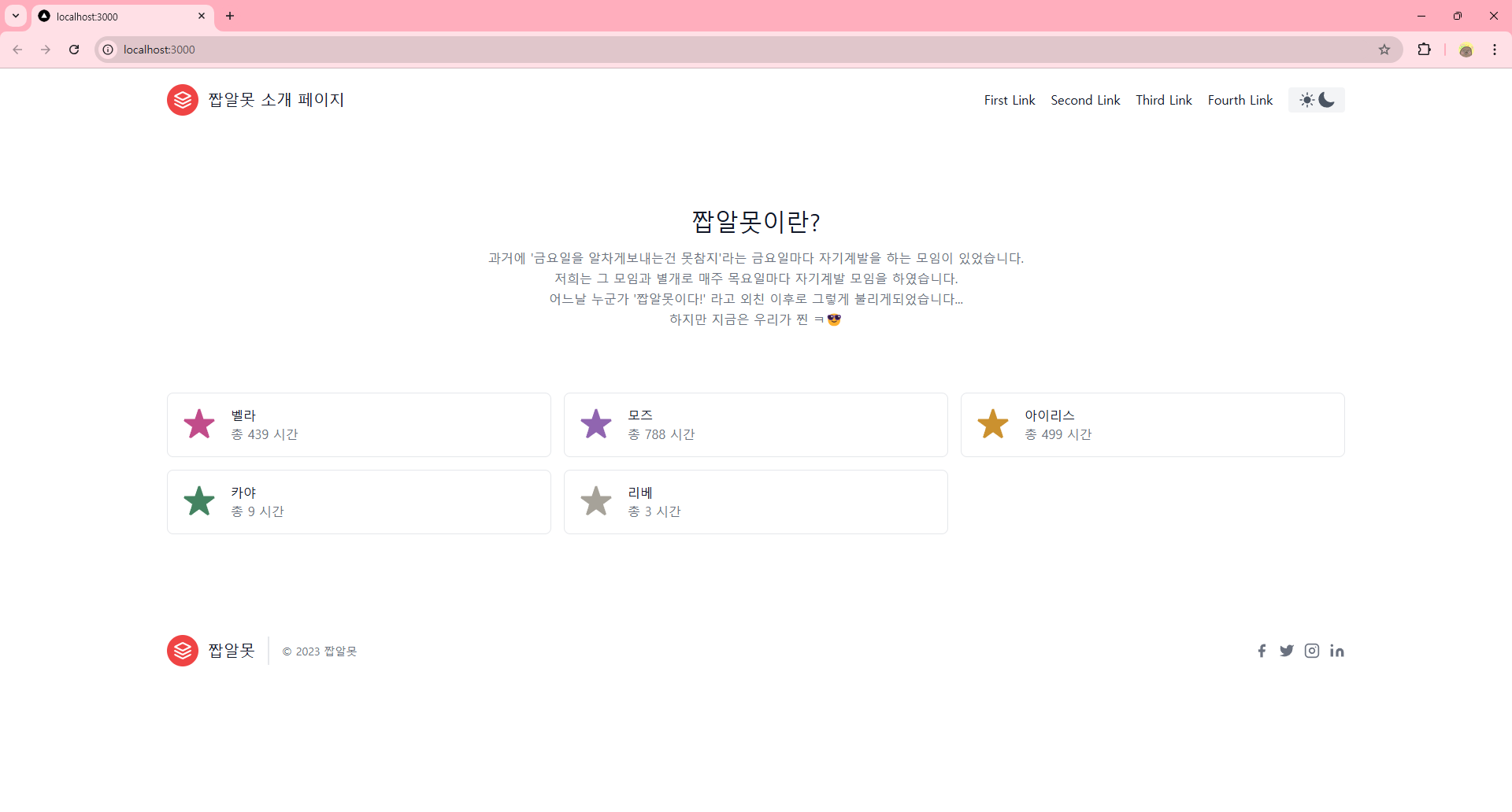
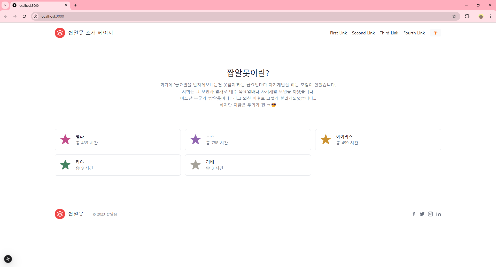
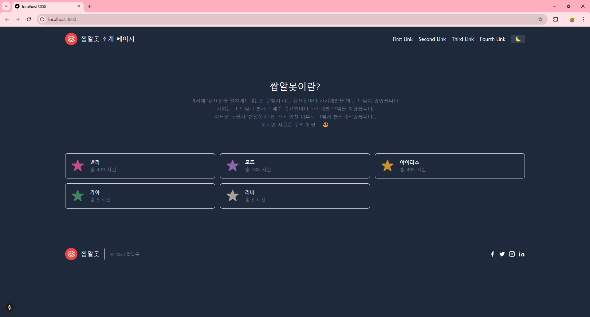
배경색이 변한 것을 볼 수 있습니다! 그런데 밑의 부분은 여전히 그대로입니다.
이럴 때는 RootLayout의 html에도 class를 추가해주면 바뀝니다.
export default function RootLayout({ children }) {
  return (
    <html suppressHydrationWarning lang="en">
      <body className={`${geistSans.variable} ${geistMono.variable} antialiased bg-primary`}>
        <ThemeProvider attribute="class"> {children} </ThemeProvider>
      </body>
    </html>
  );
}
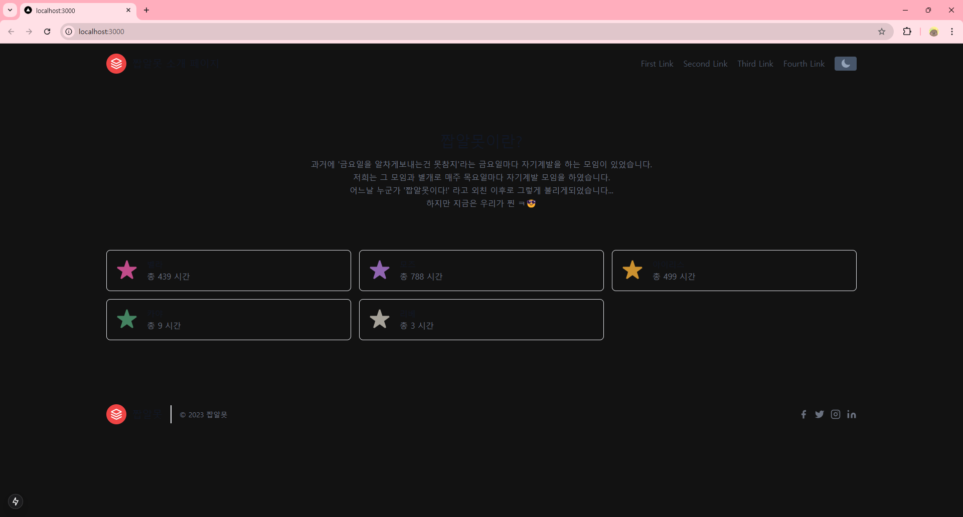
성공적으로 다크 모드를 지원하게 되었습니다.😎
추후 컬러 조합은 변경해야겠지만 지금도 썩 나쁘진 않네요 ㅋㅋ
다음에는 어떤 기능을 먼저 추가할지 고민해봐야겠어요.

'프로젝트 > 웹페이지' 카테고리의 다른 글
| 웹 개발 1도 모르는 사람이 웹페이지 만들기 프로젝트 7일차 (1) | 2025.01.16 |
|---|---|
| 웹 개발 1도 모르는 사람이 웹페이지 만들기 프로젝트 6일차 (1) | 2025.01.15 |
| 웹 개발 1도 모르는 사람이 웹페이지 만들기 프로젝트 4일차 (0) | 2025.01.08 |
| 웹 개발 1도 모르는 사람이 웹페이지 만들기 프로젝트 3일차 (1) | 2025.01.02 |
| 웹 개발 1도 모르는 사람이 웹페이지 만들기 프로젝트 2일차 (0) | 2025.01.02 |


